Can you imagine a contact centre without reports? The thought literally boggles the mind! How would supervisors and managers function without reports on agents, interactions, and queues? Not to mention KPIs like first call resolution, average speed of answer, abandon rate, and service levels.
 If you asked a contact centre manager or supervisor to NEVER use reports again they would probably tell you to take a flying leap off of a very tall building!
Very early in my career I worked in a small centre doing inside sales, both inbound and outbound calling. The centre revolved around printed dot matrix reports that were hung on the cubicle walls each day (dot matrix printers used continuous paper rather than individual sheets, which made them ideal for printing large amounts of data). The agents would gather around the reports each morning to see who had performed the best on the previous day. The centre was obsessed with reports! But can you blame them? How else would they know who was doing their job and measure how performance was impacting revenue and customer satisfaction?
And though the reporting formats have evolved over the years, still today most contact centres live and die by similar static historical reports. Real-time metrics have been added to the mix and are typically displayed or managed separately, on large monitors or desktop displays. Add in digital channels and most businesses are using 5-8 different interfaces to manage and measure contact centre performance. This makes it tough for contact centre managers and supervisors to make sense of all the data.
According to CCIQs 2016 Executive Report on Performance, the top strategic initiatives for the next year include interaction analytics and improving desktops and dashboards.
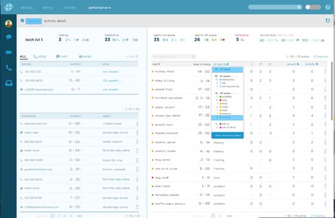
We’re entering a new era in which interactive dashboards are beginning to replace the tabular and graphical reports of old. These dashboards are fast becoming the single source of both real-time and historical data metrics for the contact centre.
Dashboards that provide a dynamic view into contact centre performance serve as the “control centre” for customer sales, service and support organizations.

It’s simple and fast. Just a couple of clicks and your dashboard will filter the data to perform the exact analysis needed. Best of all, the dashboard displays will automatically refresh, giving you an up to the second view of queues, agents, and KPIs across ALL service channels, not just voice.
It’s definitely a new mindset for contact center managers and supervisors, and for that matter agents too. Throwing out the reports of old won’t happen overnight. But using interactive, dynamic dashboards and views will offer a much simpler and faster mechanism to impact the customer experience. That’s what it’s about after all. Keeping customers happy and coming back for more.


